Do you have loads of patterned paper scraps that you can't bear to throw away? Here's a fun way to use some of them. I make bookmarks with all kinds of crazy combinations. The librarian at my daughter's school loves them. My mom has taken them to the ladies in her quilting club. My kids run off with them as fast as I can make them. And I always have at least a few in books that I'm reading. So let's get that pretty paper out of the dark and make something useful and beautiful!
I have two of Papertrey's bookmark dies - I had one, but I made so many bookmarks that I decided to add another one to speed up the process a bit. As you can see below, the two of them together measure about 3.5 inches wide and 5.5 inches tall.
This is ordinary white Contact paper. It comes in a roll 18 inches wide and 24 feet long. I've found that it's a very economical alternative to using my Xyron for this project. A roll of Contact paper only costs a few dollars and will make - get this - over 500 bookmarks!
I use my scissors to cut an 11 inch piece from the roll of Contact paper - it's the height of two bookmark dies, and conveniently, small enough now to put in my paper cutter.
Next, I take my 11 inch piece of Contact paper and cut it into 3.5 inch strips. Each strip will make four bookmarks. So this one piece that I cut from the roll is enough for 20 bookmarks.
Now it's time for the pretty paper! Get out your scraps and dig around for the ones that are strips, preferably with a nice square end. I find that good 90 degree corners at the ends of my strips make this process the easiest it can be (less trimming as you go).
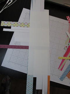
Okay, I've got a bunch of strips to play with. Now I peel the backing part way off of one of my Contact paper strips. Then I start laying strips on the sticky paper as close together as possible. One of the great things about using Contact paper for this is that the bond is not permanent yet - if you mess up the placement, you can pull up your paper and fix it. After it's been through your die cutter and had some time to set, the bond will be strong.
Just keep sticking scraps onto the Contact paper. Let the ends hang off for now - we'll trim them soon. I switch directions sometimes. This is where the 90 degree corners come in handy. I don't get too concerned with what kind of patterns I'm mixing on these. Some of the craziest combinations have been my favorites once the bookmarks are finished.
Here you can see the front and back of a strip that is completely covered in scraps.
Here's my strip after I've trimmed off the excess length of the scraps. Beside it are the pieces that I trimmed off. Keep those smaller pieces - you can still use them on another bookmark!
Here you can see how the two bookmark dies fit nicely on the strip that I just made. I'll run it through my Big Shot with the two on one end of the strip, then again with them on the other end, resulting in four bookmarks.
Here are the four bookmarks after die cutting. The bookmarks are a little bit floppy at this point. The Contact paper alone isn't really sturdy enough. So I cut cheap white cardstock with the bookmark dies and glue them to the back of the patterned bookmarks.
Frugal note - I use cheap white cardstock in my Tim Holtz folders that hold my stamps. For that, I use 6 by 8.5 inch pieces. This means that I have tons of 5 by 8.5 inch pieces leftover. Each of these will yield three bookmark die cuts.
Here are the bookmarks all glued together, with their holes punched out at the top. I've found that the hole in the die cut is pretty hard to push out of the Contact paper, so I use my Cropadile to punch a hole in the completed bookmarks.
Here are a few other bookmarks I've made. As you can see, sometimes I place the first strip of patterned paper at an angle and work from there. Again, the 90 degree corners at the ends of the strips make placement easier. These are really fun to make. Have fun with your scraps!


